Creativity is an evolution that has been around for as long as humans have roamed the Earth. Over the past few decades especially, creativity has exploded as new and improved means of expressing creativity have surfaced. A common misconception is that creativity is something we are born with rather than something that develops over time. In fact, creativity can be learned and it is our personal experiences, our deepest emotions, and our strongest desires that hone people into becoming creative individuals.
Being that we are a graphic design studio, this blog will be aimed towards designing graphics specifically. The rules of creativity, however, remain the same. This guide can be used as your own personal reference with ideas to get your creative juices flowing! But don’t be afraid to bend if not break the rules as well! 😉
1. CREATE A VISUAL ILLUSION
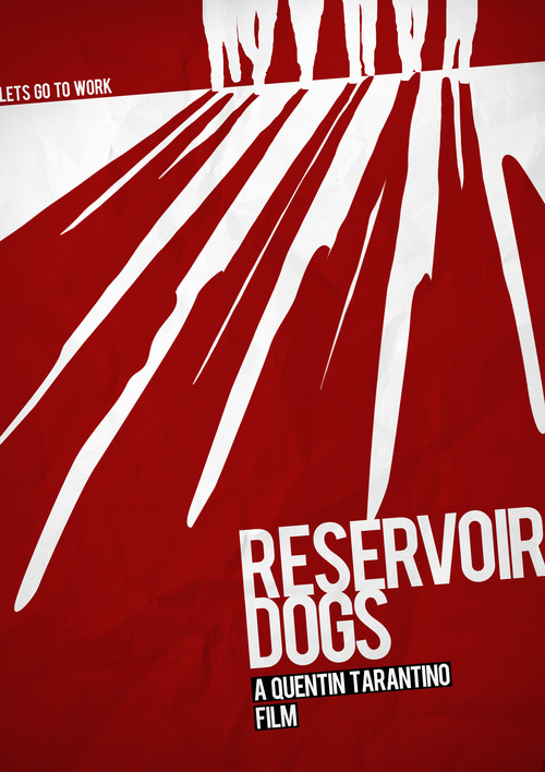
Adding the illusion of shadows as people are walking away leaves the rest up to the imagination. At first look, the white on the top represents the six characters walking while the red below them represents their shadows. At second look, the red of their shadows also represents bloodshed. Using only two colors is what creates this sort of illusion.
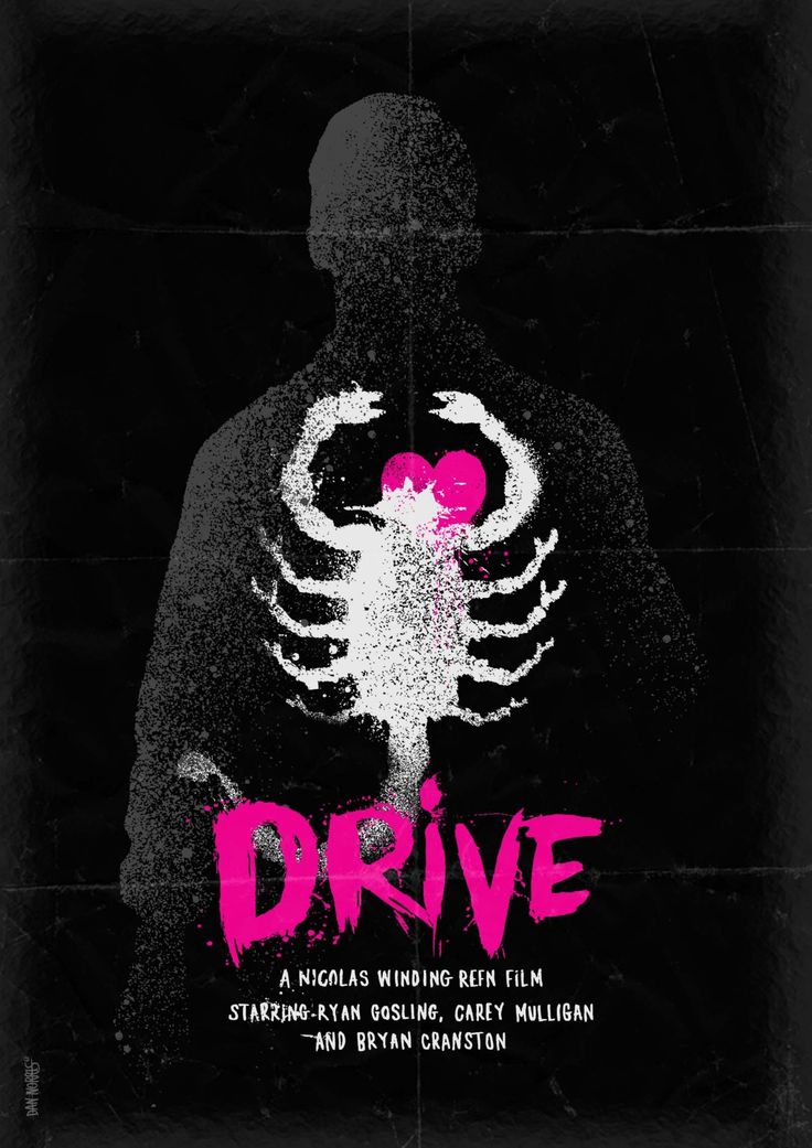
2. INCREASE THE CONTRAST
Using a bright text color on top of a dark background allows for the image to convey a sense of importance, suspense, and potentially danger. Doing so can be rough on the eyes, but it definitely gets the message across.
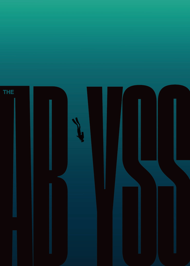
3. KEEP IT MINIMAL
Sometimes the simplest designs have the most to say. They’re straightforward and get straight to the point where as other designs are more dynamic and more difficult. Just because a design is simple does not mean that it is easy! In fact, some of the simplest designs are the most difficult to create.

4. INTEGRATE SHAPES
Shapes are often used as central design elements and have been found to generate a lot of attention. Get creative with your shape and use it as a multi-purpose object!

5. SAY IT WITH LETTER-FORMS
Use text as a design element! Sometimes it is all in the writing and adding more could take away from the main objective.
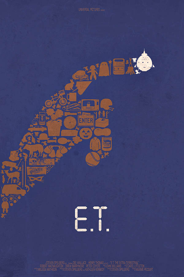
6. INCORPORATE A VARIETY OF ICONS
Using several different icons to make construct one general icon is a great way to communicate several messages all at the same time. This also adds an element of fun to your design!
7. BOX IT IN
Symmetry and balance are visually pleasing to the eyes. So when designing an image, try boxing it in. Using lines and boxes to separate the design from the information is a very modern approach that is common amongst businesses.
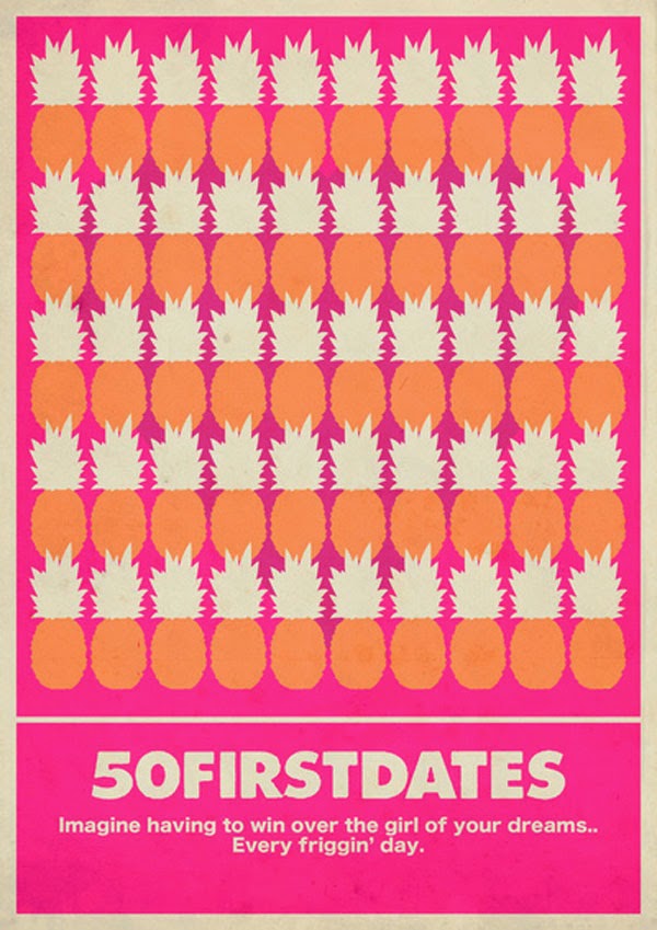
8. USE AN ACCENT COLOR
Accent colors when used in a design are used to direct attention to a specific detail that is important.

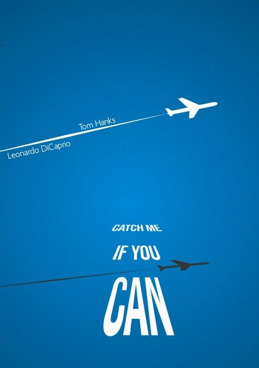
9. VARIATE TEXT SIZES
Create a visual illusion using text! Vary the text size of multiple words rather than just one as shown below:
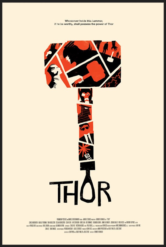
10. PERSONALLY STYLIZE ILLUSTRATIONS
Designing your own illustrations can be time consuming but the payoff at the end is well worth it. Consider the design below where each individual section of the hammer was illustrated to portray it’s own story. Now that’s creativity!
Now that we’ve given you the tools to implement when designing, get to it! You too can start living a creative life. All you have to do is but your whole heart, mind, and soul into your work! That’s what we do all day, every single day.. and look how it has worked out for us!

